The Recovery community Brand Identity & Website
The Recovery Community is a social-impact project supporting neurodivergent adults in recovery through accessible, activity-based community programmes. I developed the visual identity and creative direction for the project across branding, digital design and moving image.
The identity was designed to move away from the clinical visual language often associated with addiction and recovery services. Instead, I wanted to create something bold, contemporary and optimistic — an identity that communicates movement, connection and possibility while feeling welcoming and accessible.
I designed the logo and wider visual language before translating the identity into a responsive website. The website was developed to clearly communicate the organisation’s purpose, programmes and values while creating an engaging and straightforward experience for participants, partners and organisations looking to refer people into the community.
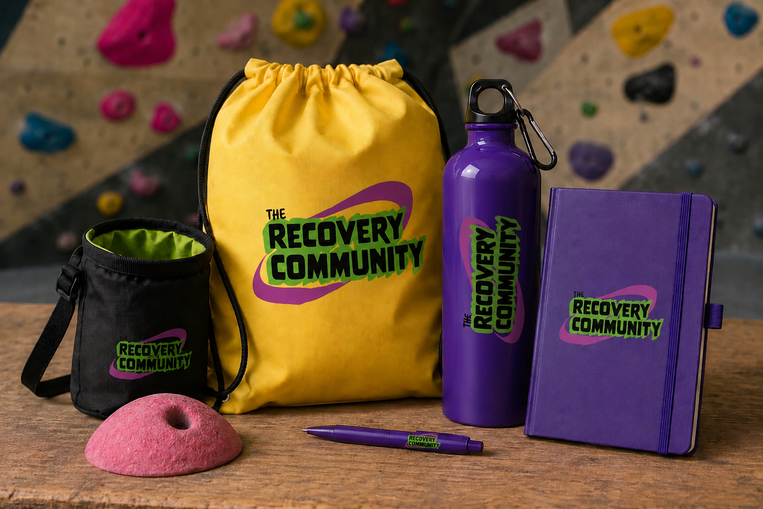
Working across identity design, typography, layout, digital design, art direction and film allowed me to create a cohesive visual system across multiple formats. The project demonstrates my multidisciplinary approach to design — taking an idea from its initial concept and developing it into a complete visual identity and communication platform.
Interested In The rec0very COmmunity
They are based in East London and run multiple recovery activities each week. You can contact them directly on their website, they would be happy to hear from you and receive any referrals if you or someone you know would benefit from what they offer.
Equally if you are interested in working with me to design your brand identity & website, then please email me using the email in the footer OR you can submit a message here.